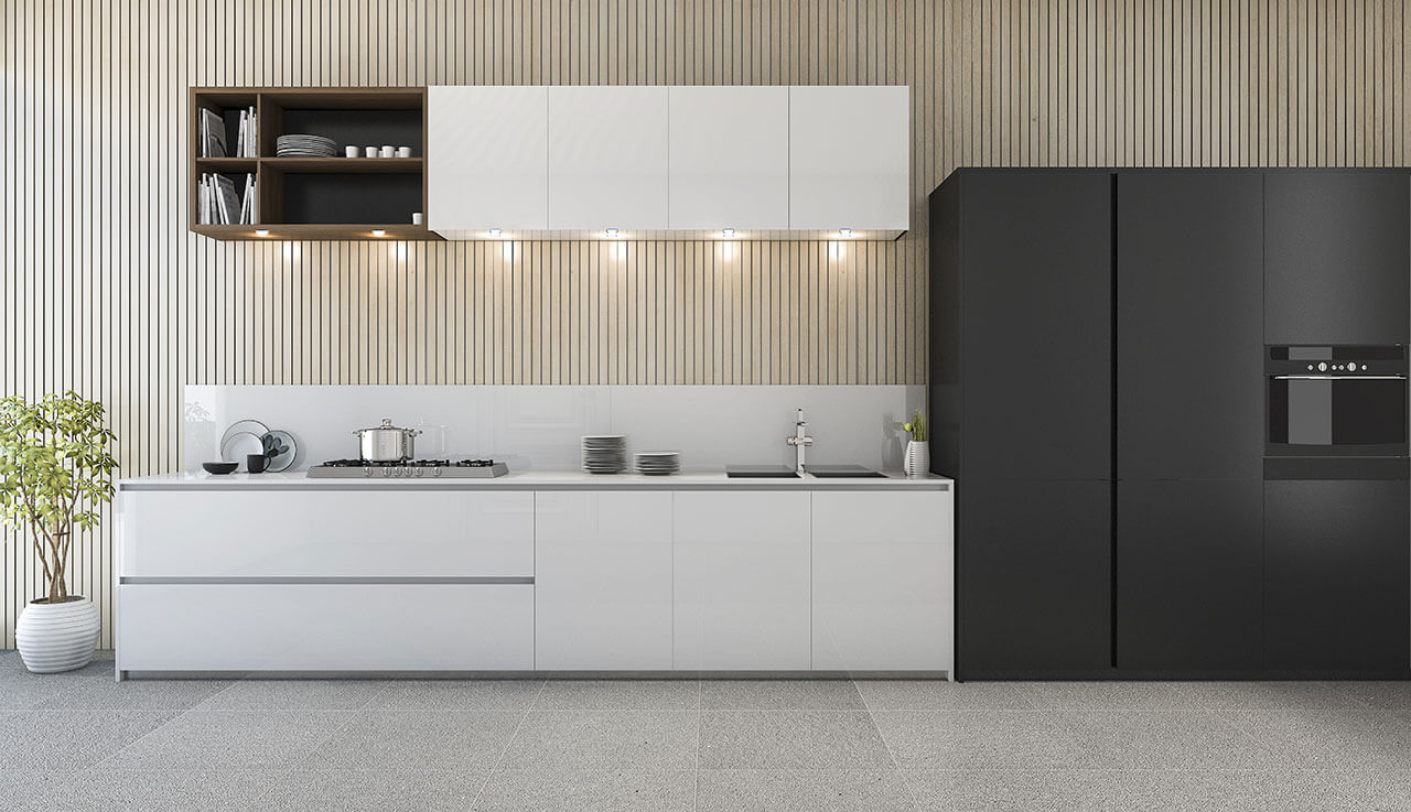
White is a safe bet if you want to achieve a spacious look for interiors. Arrivae gets in touch with expert to understand the impact of using this colour scheme in combination with other light hues in the kitchen.
Client Expectation: Ramesh Khaitan had a small kitchen comprising of 90 sq. ft. area in Andheri (W) with one window and platform on both sides and wanted it to look as spacious as possible.
Uniquely Yours Solution: Used white to achieve a spacious look and feel as desired by the client.
Designer Kalyani Kale
What were the functional elements kept in mind to ensure the spacious look for the kitchen?
To give the kitchen a spacious look and feel, we used white for all the shutters. The white colour scheme was continued on the overhead and cabinet shutters located below as well.

Apart from white did you use any other colours to match the interiors of the white kitchen?
We used light grey colour tiles as dado and black granite for the platform. The combination of grey and white used in the kitchen interiors gave the kitchen an airy feel as a very light shade of grey was used here. This enhanced the look and feel of the kitchen and helped to achieve the spacious look as per the client’s requirements. The flooring was done in pale grey. This again complemented the kitchen interiors and gave it a flawless look.
How did you cater to the space constraint challenge for the kitchen?
Since we had a limited space (90 sq. ft. area) to work in the kitchen, white was the apt colour to be used to achieve the desired result. A part of the kitchen also had a tall unit that was again decked up in white to make the kitchen look big.
Would you like to talk about any specific challenges faced in the project?
With regards to space constraint, we had to ensure that the material used on the shutters do not get stained considering the light colour scheme. To overcome this challenge, we used white lamination that does not pale easily. The advantage of using this material is that it is easy to clean and is an easy maintenance material. Similarly to add style statement to the white kitchen, pale grey tiles on the dado were laid in a herringbone style. This feature gave an interesting look compared to the regular rectangular style used commonly in the kitchen.

