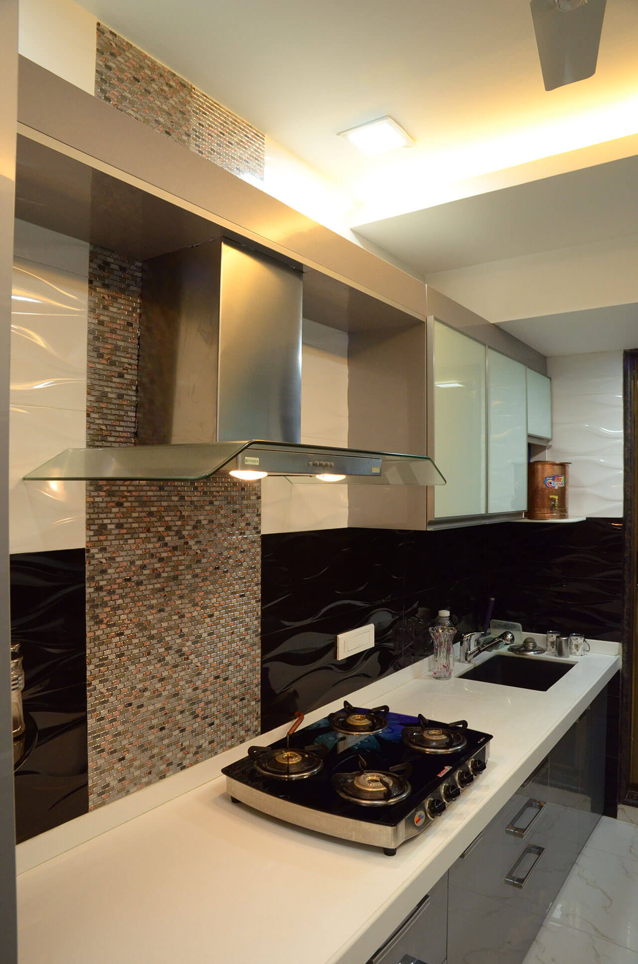
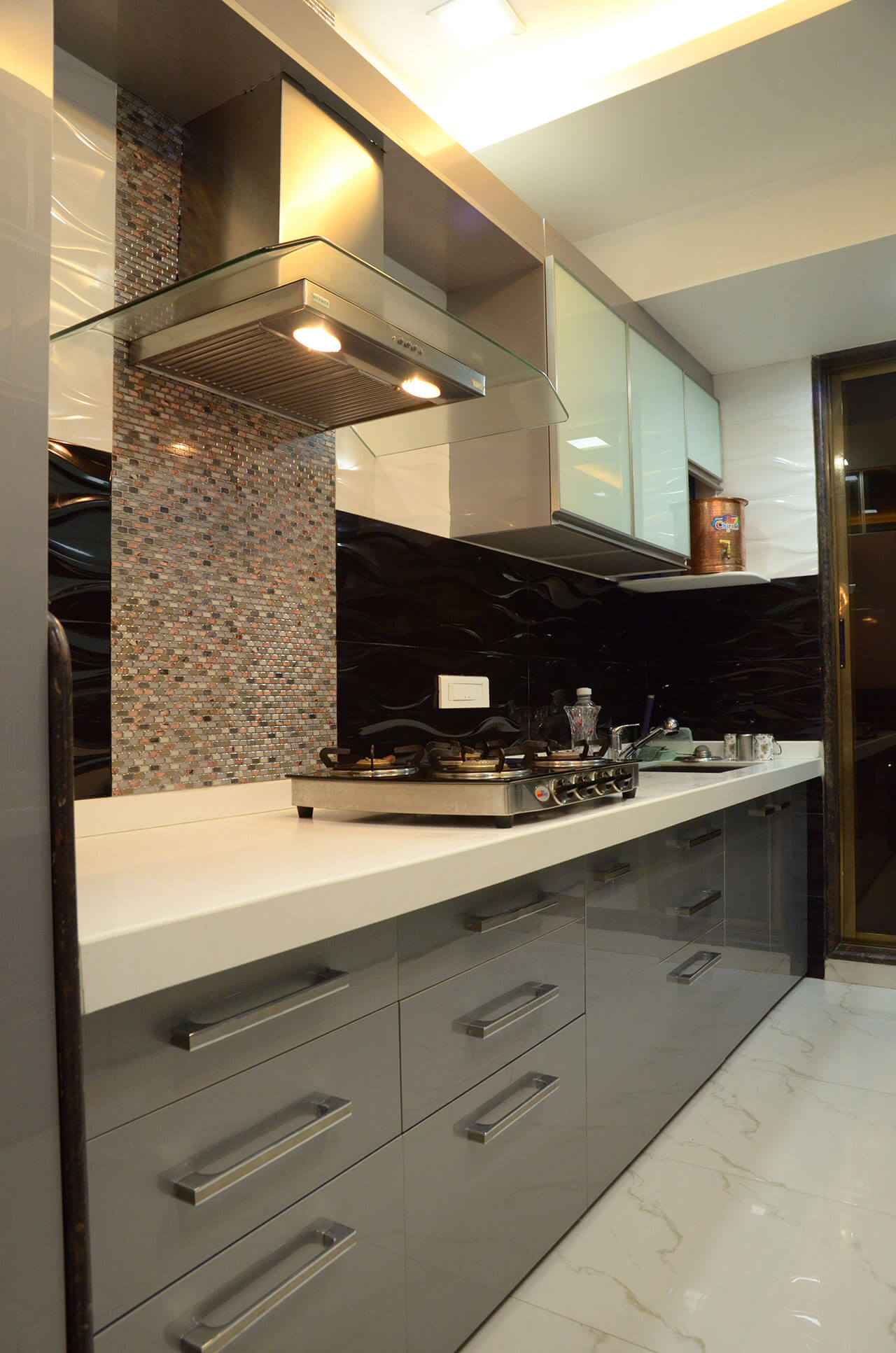
Simple, clean lines define a sleek kitchen. Arrivae speaks to expert to guide you on the different features that can be used to give the kitchen a sleek appearance.
Architect Ashish Vaidya
Client Expectation: Wanted sleek kitchen with straight lines.
Uniquely Yours Solution: Used white and grey colour scheme for walls, ceiling and flooring and laminate for shutters.

What is the main concept used in the kitchen?
The kitchen has a modern look and feel and used bold colours and straight lines to highlight the modern concept.
Could you tell us about the highlight of this kitchen?
The glass bisazza tile behind the chimney area is the main highlight of this kitchen. This feature stands out against the light background that surrounds the space.

What are the unique features used in the kitchen?
We used white dark painted glass for the top storage. The chimney pipe has been taken from the top of the storage and concealed with mouldings. Fascia shutters is in acrylic and glass and the flooring is done in white vitrified tiles. The kitchen countertop has been done in white Corian. For ease of access, the cooking platform is on one side and preparation on the other.
Did you face any challenges while executing the project?
Since the space was compact in the kitchen, the only space available was above the sink. We used the space above the sink to create storage. In spite of space restrictions, we managed to use the space near the chimney and kept it open to give it a spacious appearance.

