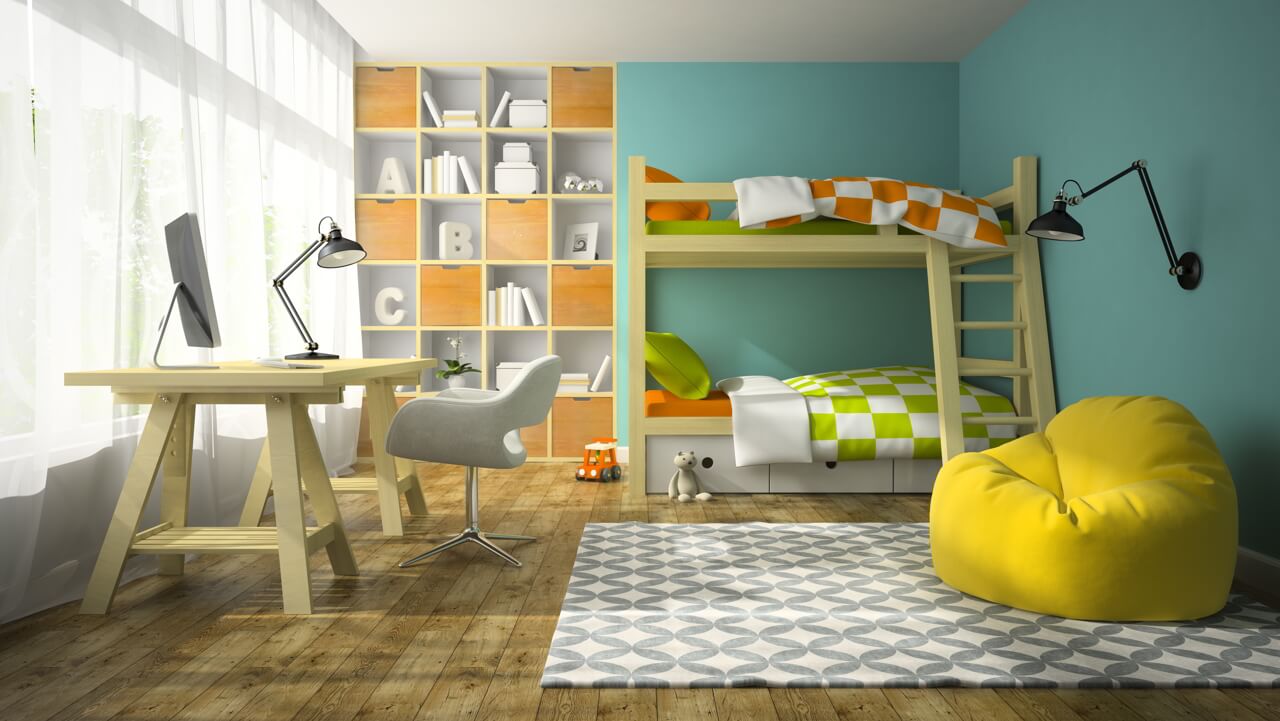
Bright colours blend well with kid’s interiors and add a unique character to the space. Arrivae interacts with expert to get suitable cues to use the right proportion of colours to bring cheer to the kid’s room.
Architect Omkar Mathkar
Client Expectation: Sober look coupled with personalized design.
Uniquely Yours Solution: Gave a personal touch to the space using wallpaper with kid’s photo.

What was the colour story followed in the kid’s area?
Since yellow was the favourite colour of the kid, the design in the kid’s space was highlighted with this colour. Earthy tones like light and dark brown apart from the kid’s favourite colour was followed throughout the space. Although the ratio of yellow colour used in the kid’s area was less than 15 percent, the space managed to garner the right amount of attention.
How did you fulfill the essential requirements of the kid’s space?
For Mr. Bhoir’s kid’s room, essential furniture like wardrobe and study table was placed in the kid’s area. To help the kid focus on studies, the study table was located in such a way that kept distractions away. As the kid had a special liking for cars, we designed the wardrobe with the car theme.
What was the client’s reaction to the end result?
Mr. Bhoir was appreciative of the design and extremely happy with the way the kid’s room had shaped up. We had worked with him before and did not face any hassles while executing the project. It was smooth sailing throughout.

