Kid’s room need to have a right balance of furniture and furnishings. Adding creativity to it makes the space functional and stylish. Arrivae takes a look at the functional aspect of the kid’s room.
Keyur Asarawala, SK Designs
Client Expectation: Desired gender neutral design for kid’s space.
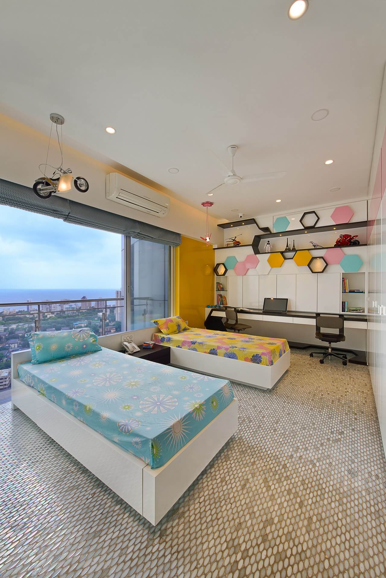
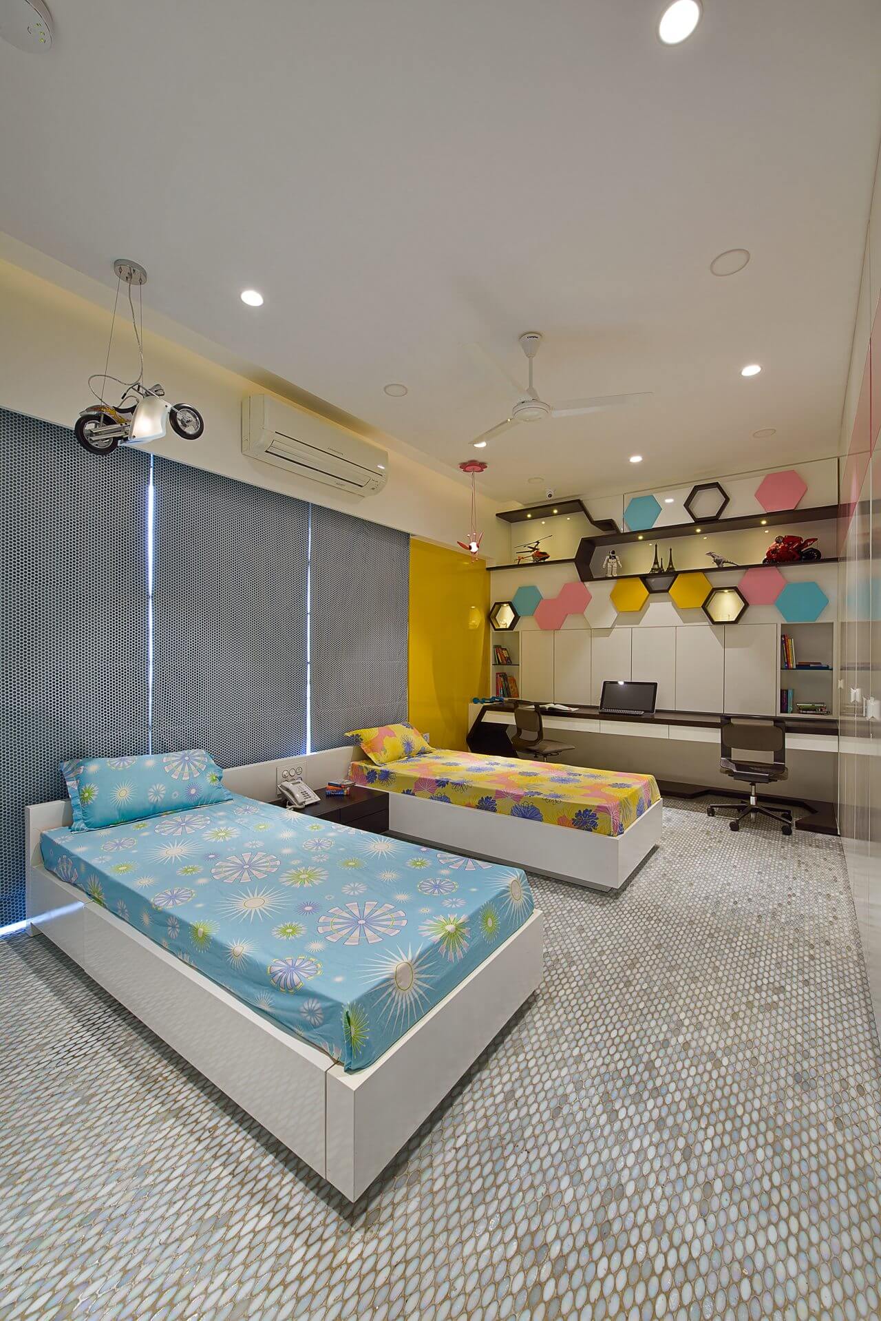
Uniquely Yours Solution: Used the space optimally and accommodated maximum storage as far as possible. We did not want the space to look cluttered and filled. Bed was designed with a slide feature incorporated in it. This ensured that it could be converted into a double bed. The idea was that when the kid had a party or night out, they could adjust and accommodate four people comfortably. During the initial discussion phase with the client, we had worked out the 3 D visualization of the space and shared it with Mr. Mehul Shah who in turn appreciated the fact that the space matched the 3 D visualization seamlessly.

Did you face any challenges while executing the project and how did you overcome it?
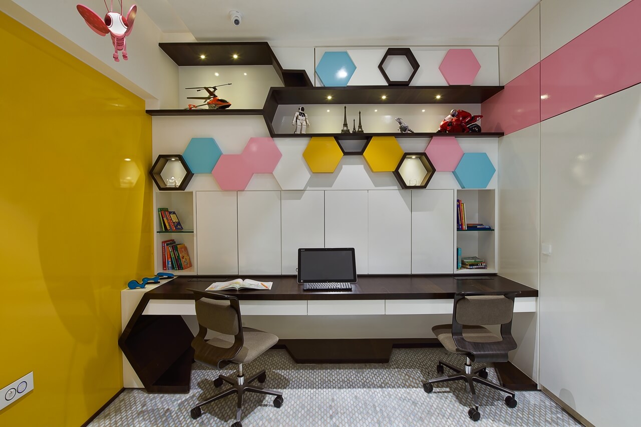
The space for the kid’s room (15/12 in size) was the main challenge. In spite of this constraint, we ensured that all the necessary furniture like study table with storage could fit into the space. To create a feeling of openness in the kid’s area, the space was designed with a kid-friendly design in mind.

What is the USP of the kid’s area?
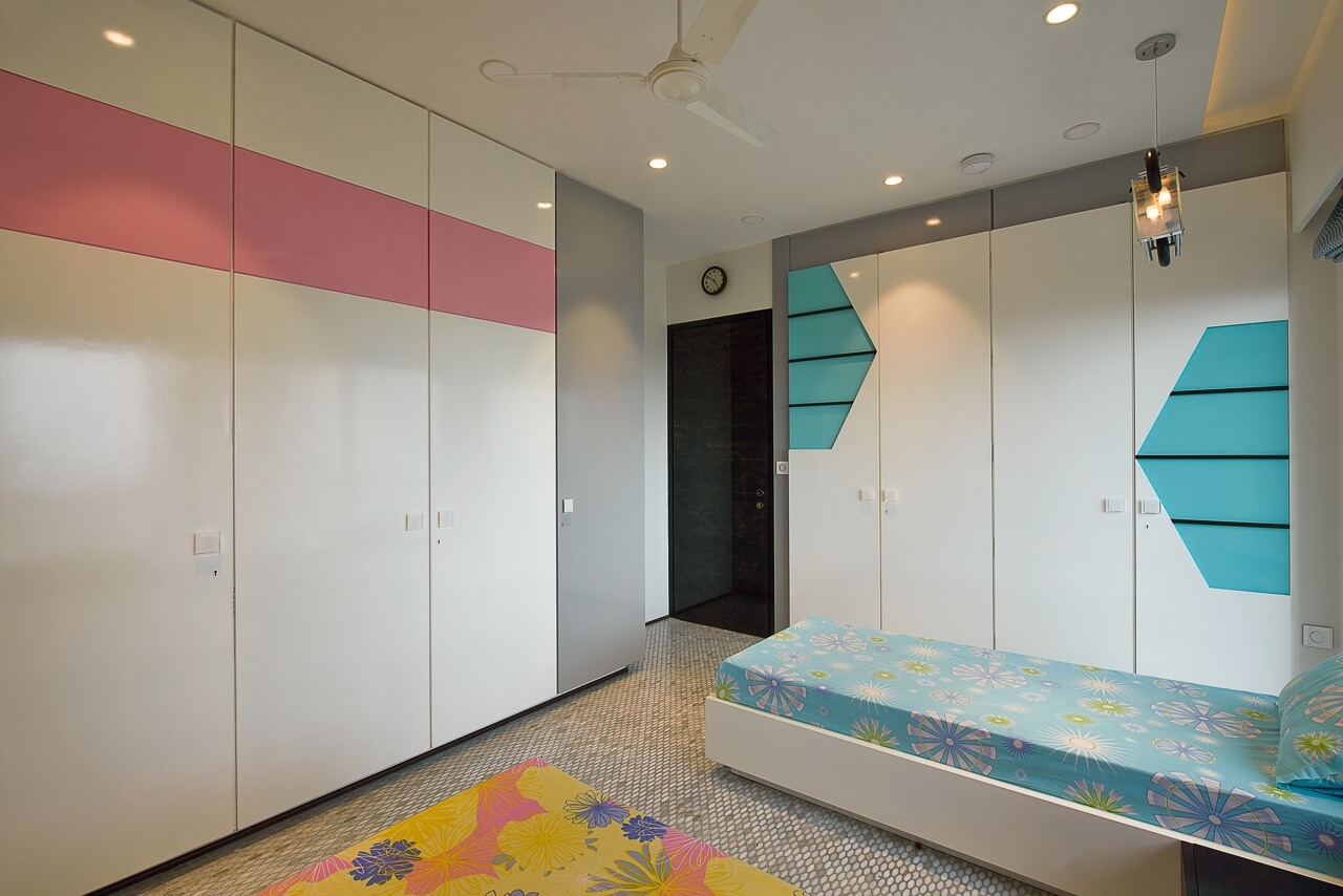
We wanted to capture the wall in such a way that the whole space could be visualized at one glance. To achieve the result, hexagon shapes with combination of different colours were used on the wall and ample storage was created behind this wall. The shape gave the area an uncluttered feel and was continued on the wardrobe as well. Walls were also decked up with unique elements of display. The display panels appeared like honeycombs, and the architect followed a sober colour scheme with pink, grey and blue so that the space does not emit a mature look and feel.


Could you highlight the design features used?
We intentionally stayed away from using standard tiles and used 4 inch oval shape tiles. The opening of the kid’s room was designed in the form of a passage to keep the privacy intact and secluded at the same time so that parents could monitor them.

