Office spaces make a remarkable difference when designed with responsible features keeping the safety and comfort aspect in mind. Arrivae uses the platform to take a look at the distinctive factors that can be incorporated and give the office space a contemporary touch.
Client Expectation: Architect Abasaheb Desai in Thane desired an office with a contemporary theme.
Uniquely Yours Solution: For the rectangle shape office comprising of 2, 887. 24 carpet area, achieved simple, nice and contemporary design with appropriate accessibility.
Architect Sanjiv Thakur
Could you mention the functional elements taken care of in the office?
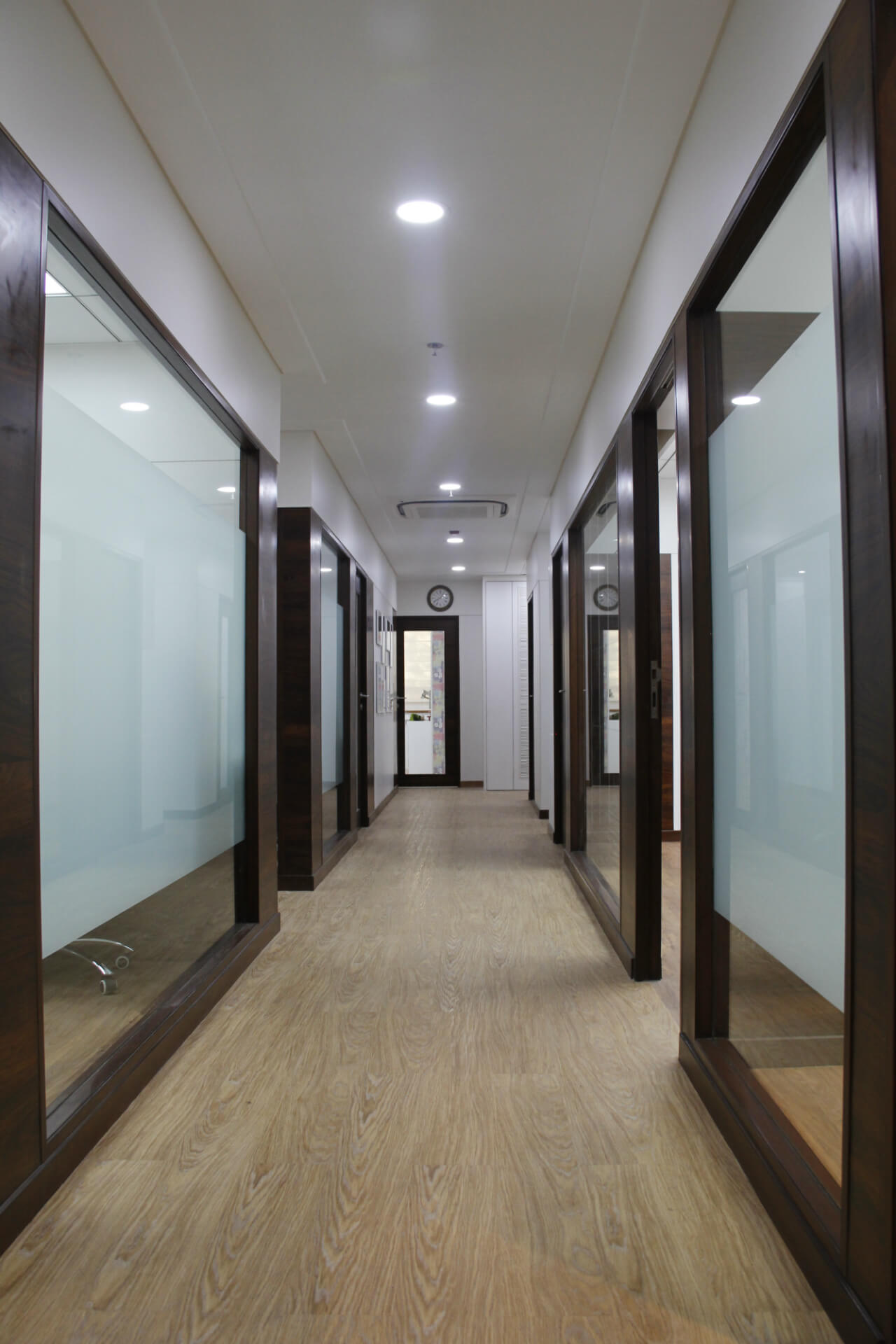
The architect wanted the office to look spacious. So we ensured the passage was big enough for people to move around freely. Similarly, the staff area had big glass windows that ensured lights could enter from the passage area to the staff area and illuminate it with natural light. Also, the client was very particular about staff not getting disturbed when visitors use the washroom. This aspect was also taken care of.
How did you ensure the safety aspect is adhered to in the office?
Keeping the safety perspective of the staff, visitors and architects in mind, we provided a generator for electricity backup and a power inverter apart from smoke detector and fire extinguishers. CCTV arrangement was also in place. Antistatic flooring was used in the server room reiterating the safety aspect.
Can you tell us about any distinctive feature that made sure the office is efficient?
We used VRV system that ensures maximum efficiency as far as energy is concerned. The technology is effective as the air conditioner functions silently and helps in saving energy. As it was a commercial building, we could put cassette AC that has inbuilt pump to drain the water and gives a nice appearance to the ceiling.
What were the different aspects that had to be considered for the architect’s office?
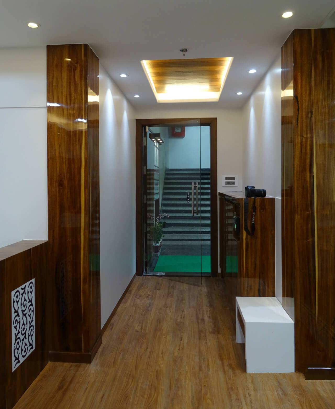
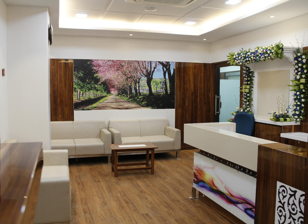
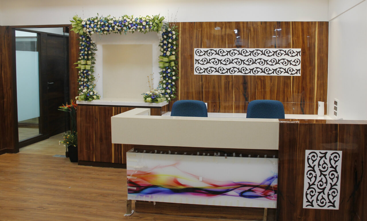
The design layout for the architect’s office had to include a reception area with seating arrangement for two receptionists, waiting area for 6 individuals and visitor’s area to accommodate six people. The architect wanted another reception adjacent to the main reception with accommodation for five people. Seating arrangement with shoe rack for 40 people was also required apart from space for idol in the reception. Electric door with biometric arrangement was also provided for employees.
What was the distinctive feature in the architect’s cabin?
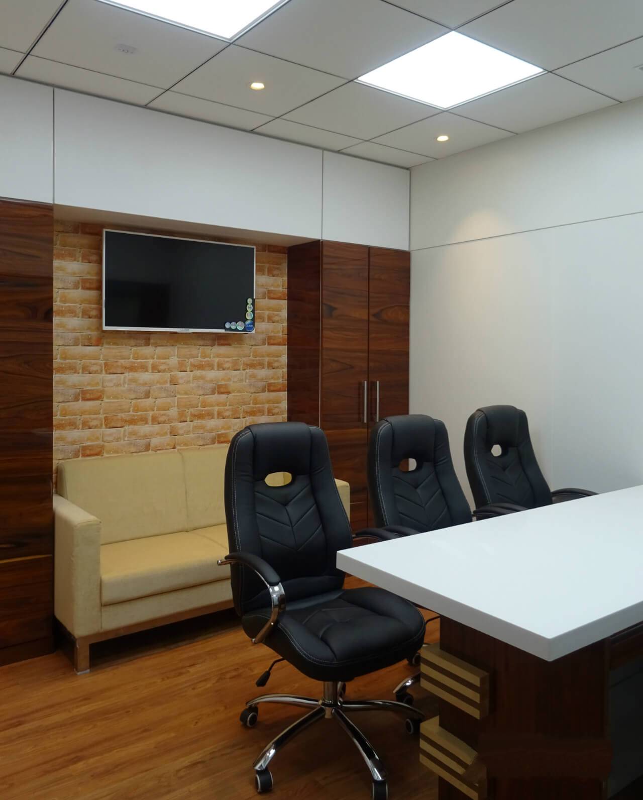
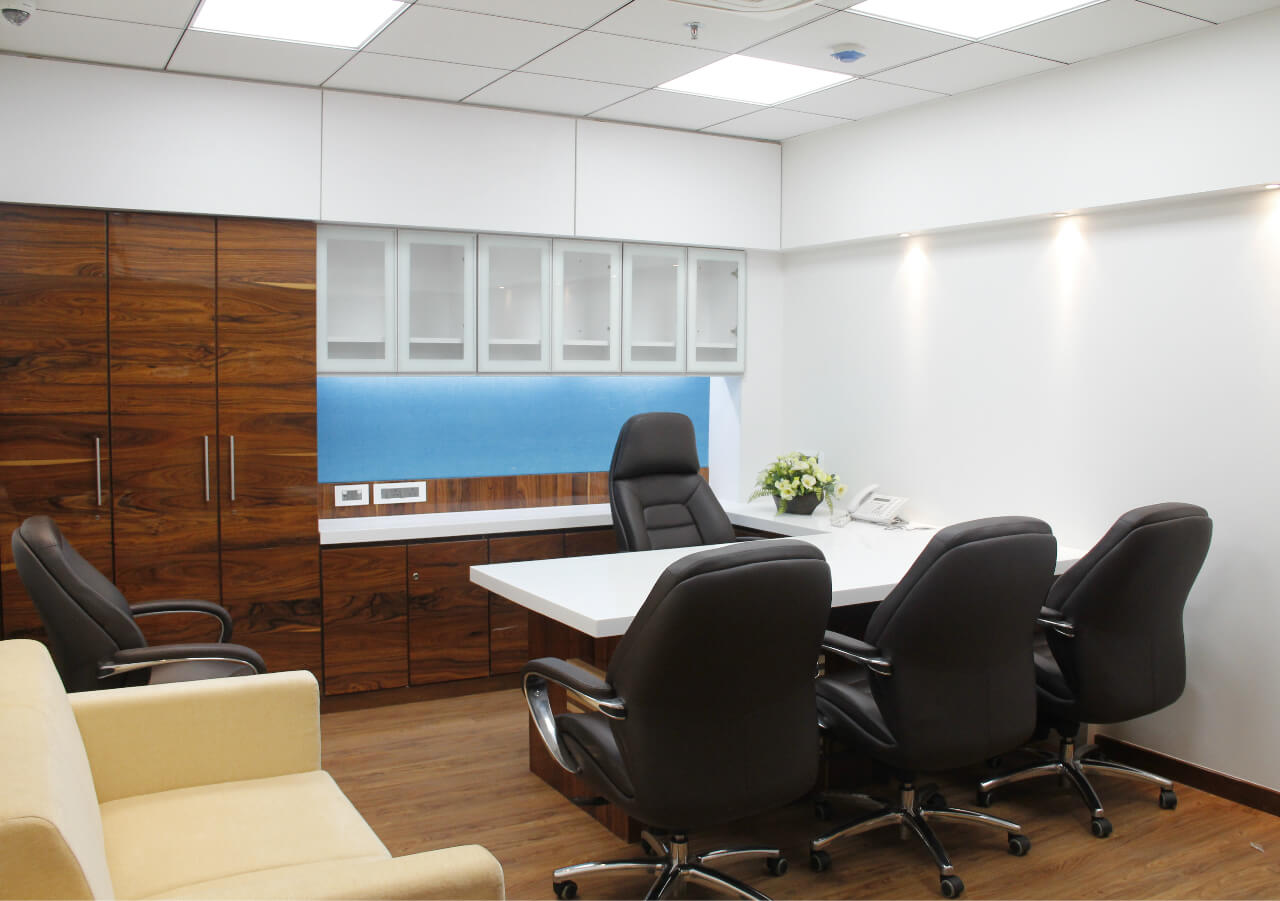
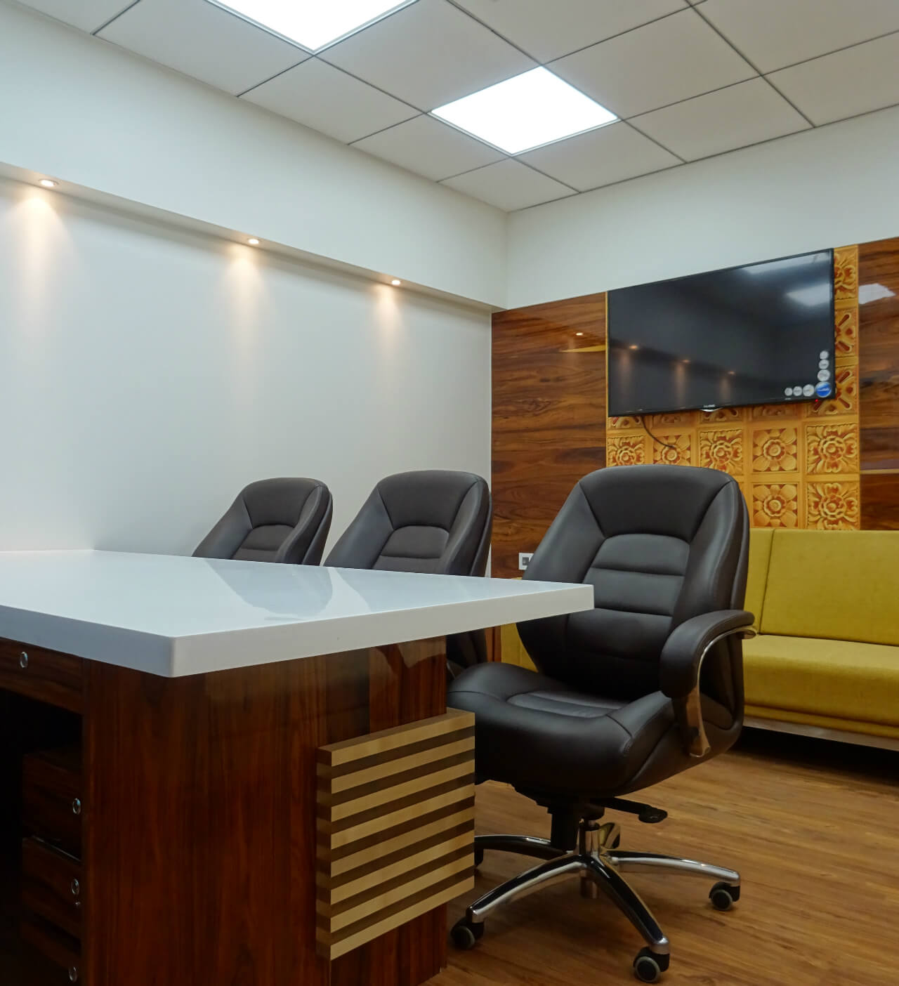
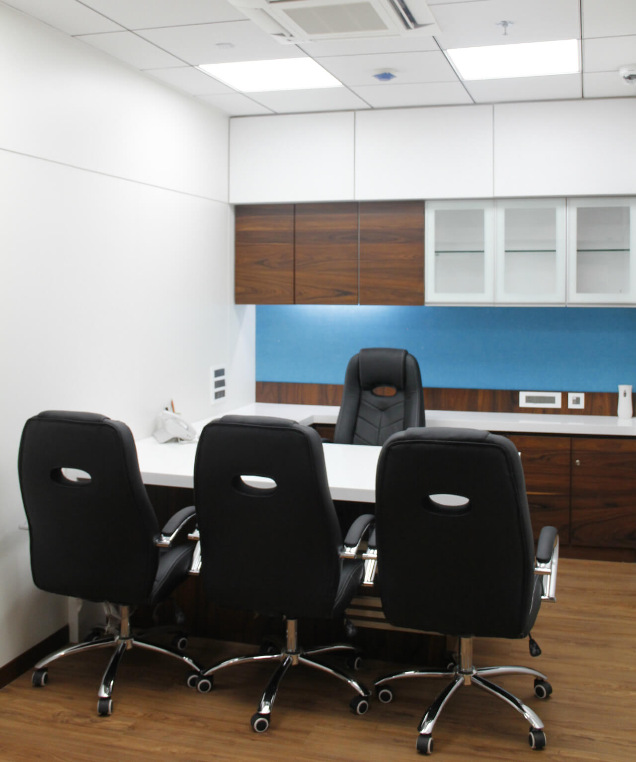
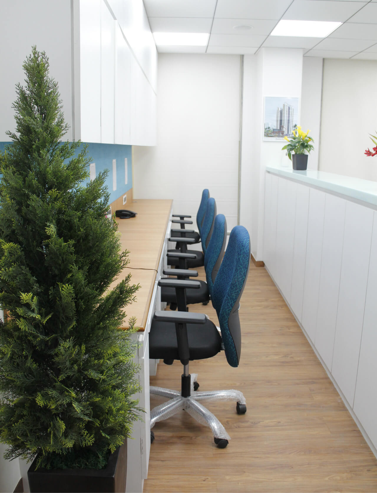
The main architect’s cabin was placed next to an empty chamber that could accommodate 8- 10 people. Accessibility to the architect’s cabin from the chamber was one of the factors desired by the architect. Therefore we designed the architect’s cabin in such a way that ensured easy accessibility to and from the chamber. Appropriate seating arrangement like sofa and seating arrangement for four people and one meeting room was aptly placed in this cabin. For discussions and meetings, a meeting room was also put in place. The chief architect’s cabin was placed right next to it and both the cabins are approximately 120 sq. ft.
Apart from the architect’s cabin, other features in the office were two cabins for engineers with seating for two visitors, one library with chairs and tables for managers and a table for one administrative manager. There was account room and cabin for the assistant architect with appropriate furniture like sofa placed for two people and three visitors.
What were the décor elements provided in this project?
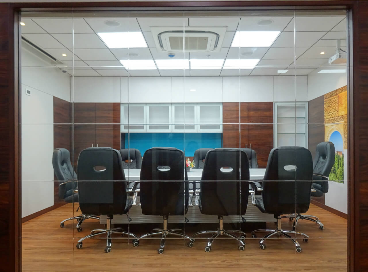
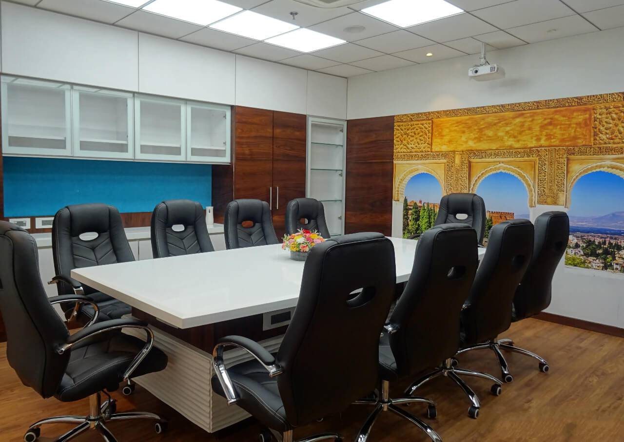
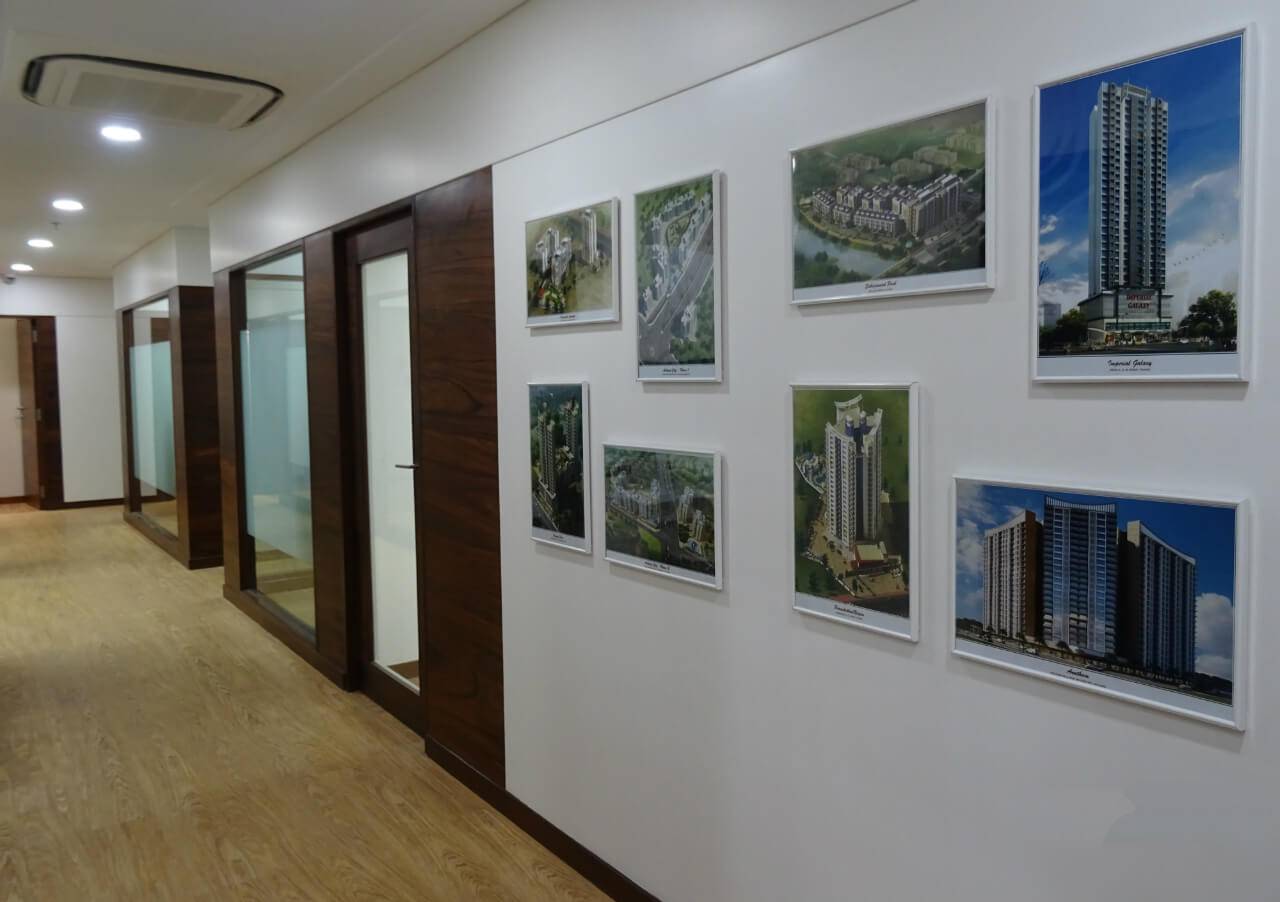
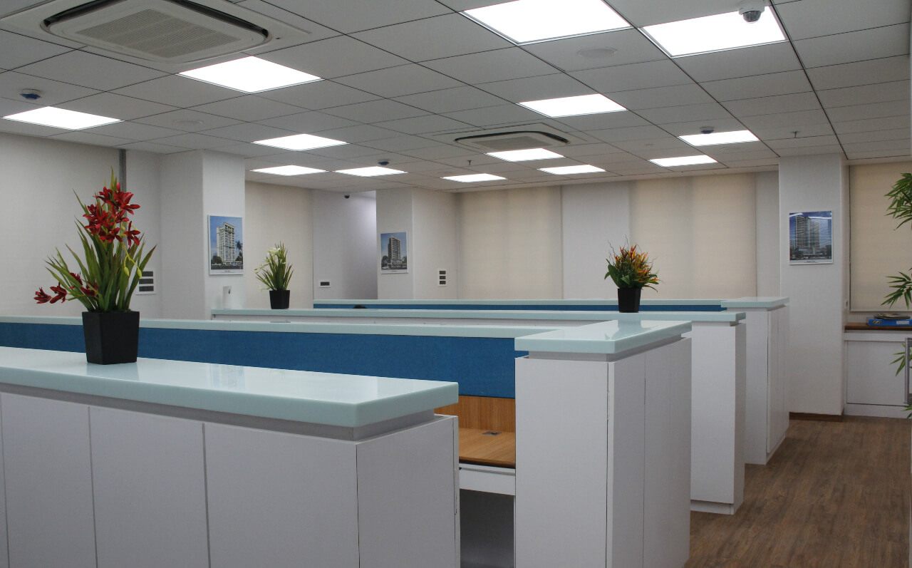
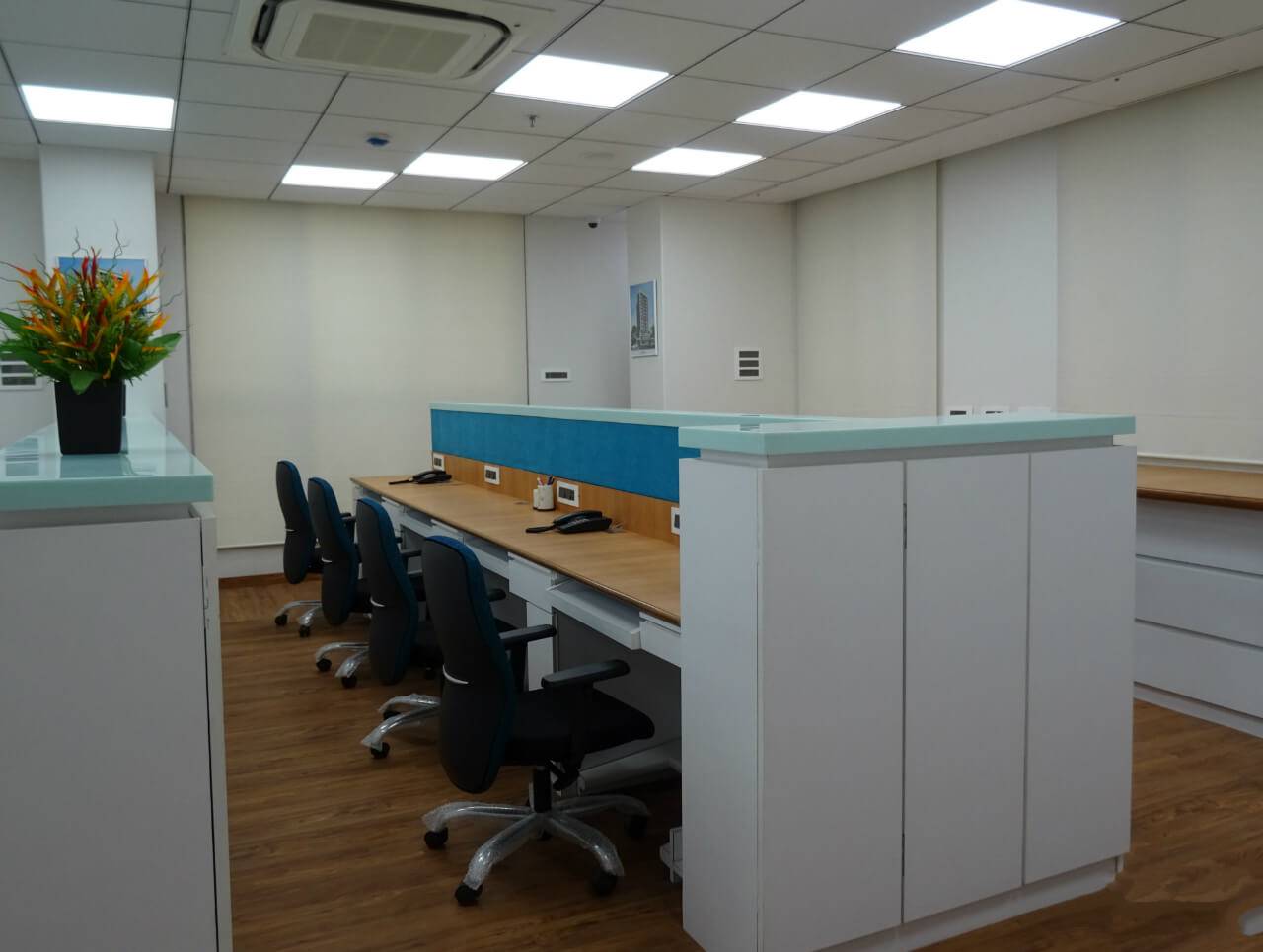
We used maximum glass with some grooves and beveled edges in the entire office. Ducting was also provided for fresh air. To highlight the space, architect’s ongoing project pictures were framed on the wall near the reception area and in the passage area. We have artificial floral arrangement in the office to give it a lively feel. For entertainment purpose, we have four televisions in the office. Teakwood and marine ply laminate was used for furniture and Corian for table top, cupboard top and partition. Veneer and laminate colour scheme and half ceiling done in gypsum with moulding and reverse light and other half was done in Armstrong ceiling. Lights are 2/2 600 mm/600 mm soft LED lights or techno lights with Norisys switches. To deck up the space further, we covered walls with wallpaper and laid MDF on one partition and then painted it.
The conference room had all the essential facilities like projector, TV connectivity and remote control screen. The licensing chamber was placed next to it that had an external entry cum fire exit for licensors. Server rooms had server racks, UPS and batteries with NVR system. Similarly the staff area was designed in such a way that it could accommodate senior and junior architects with two printers, lot of cupboards and plotters for storage and give it a clutter free appearance. Laminate and melamine polish was used on veneer and Duco paint for MDF.
