Office space can be given a sophisticated look and feel with significant play of materials. Arrivae gets in touch with expert to gauge the distinctive features that play an eminent role in giving a unique character to the office.
Client Expectation: Rna Builders head office at Kalanagar (RNA CORP) desired a contemporary, unique, international look and feel to the office with play of materials and lights.
Uniquely Yours Solution: Executed the project with elegant, contemporary feel combined with lot of accessories, textures and materials.
Architect Shahen Mistry
How did you add a creative touch to the project?
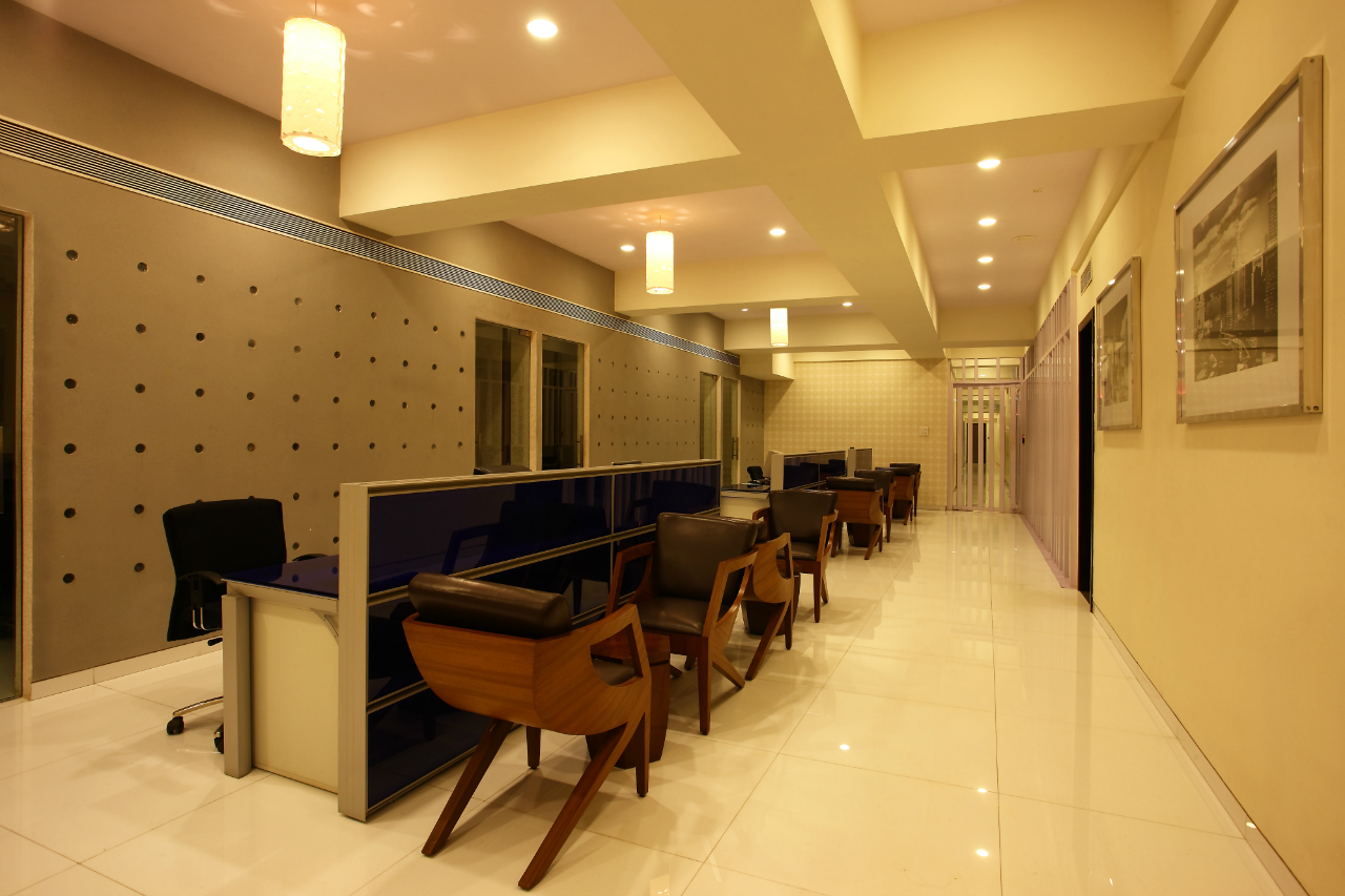
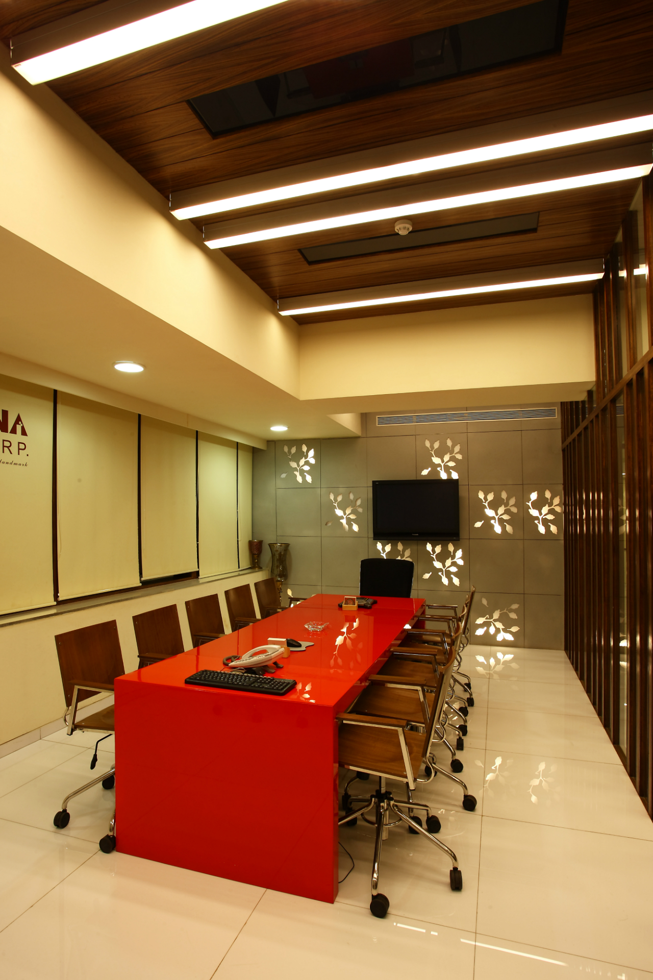
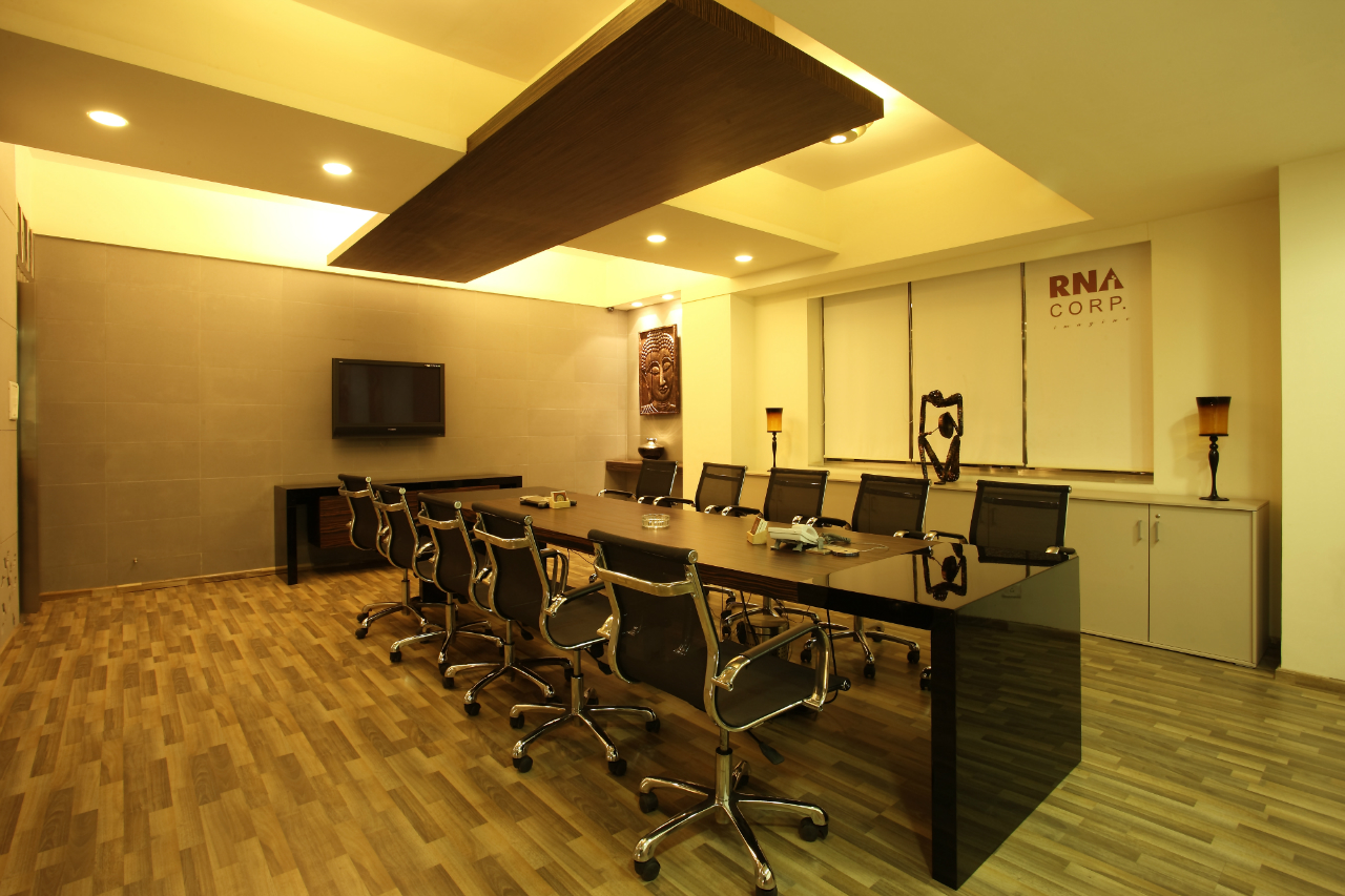
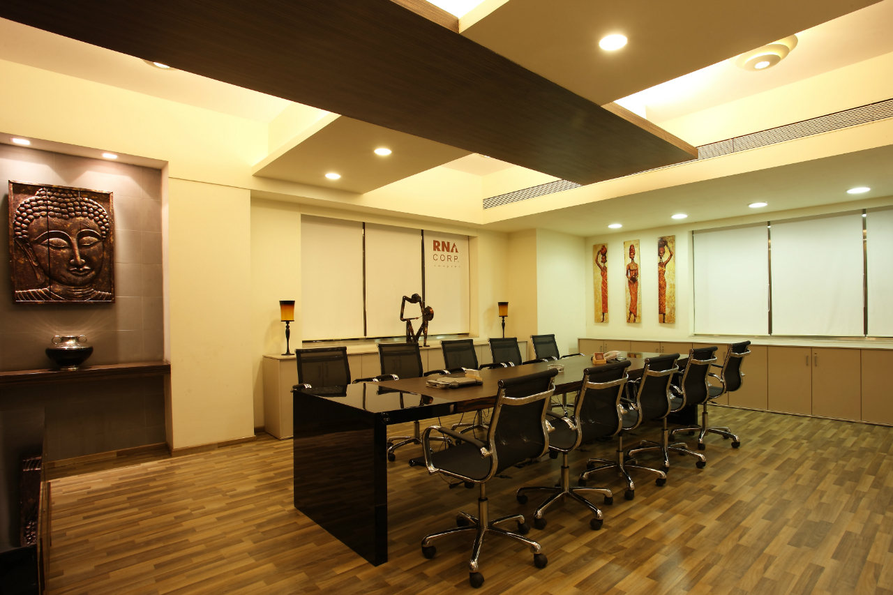
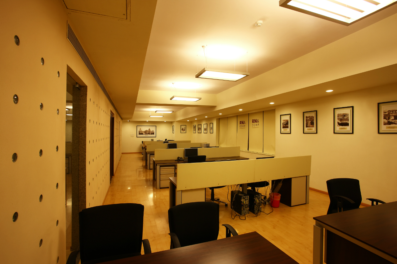
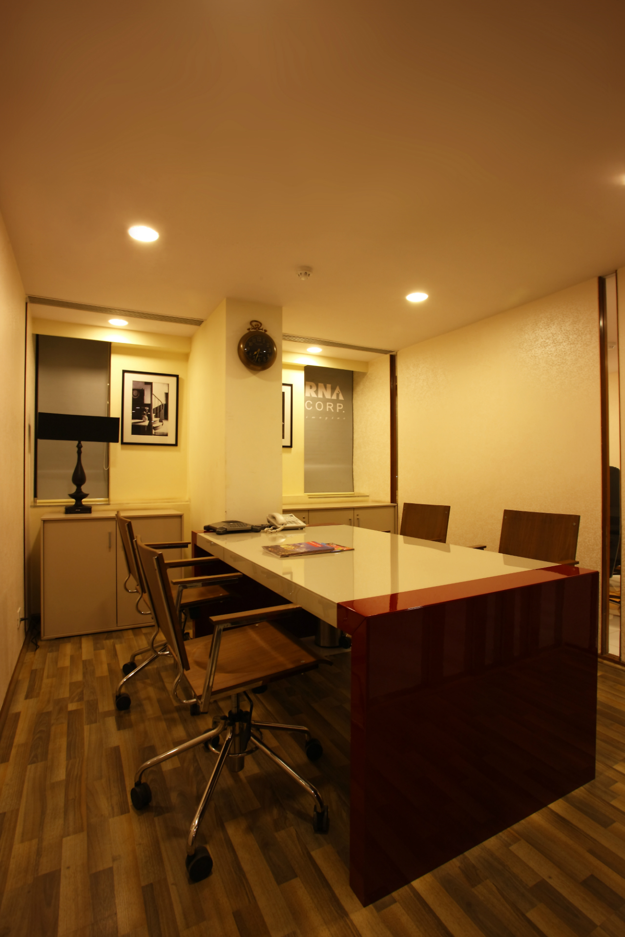
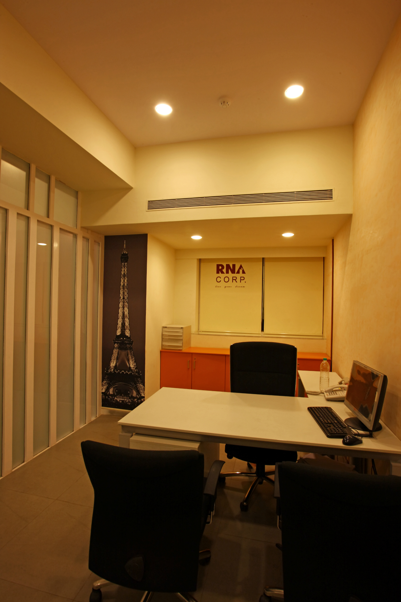
For the RNA Builders project comprising of approximately 20,000 sq. ft. we used modular furniture from MATRIX, Italy. We segregated the office space into different zones and highlighted these using unique themes. For the HR department, we used a warm and cosy theme with beige and wood accessorized Bombay theme pictures. Similarly, the marketing department had a sophisticated look and feel due to the combination of stainless steel and bamboo furniture used here. Creative furniture with laser cut panels in the conference room gives it a classy yet cosy ambience. Small meeting rooms have been decked up with graphics on the walls.
Tell us about the colour scheme used for RNA Builders?
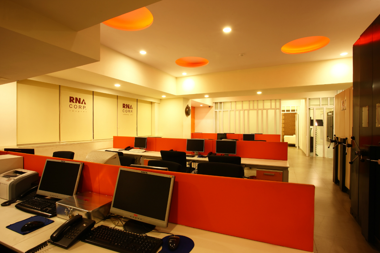
The overall colour palette was white. We played with green and orange in the staff area. Similarly, we have used the combination of orange, green and red that blends well with white to add a splash of freshness to the space.
What is the main highlight of the project?
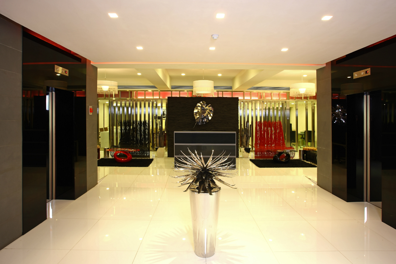
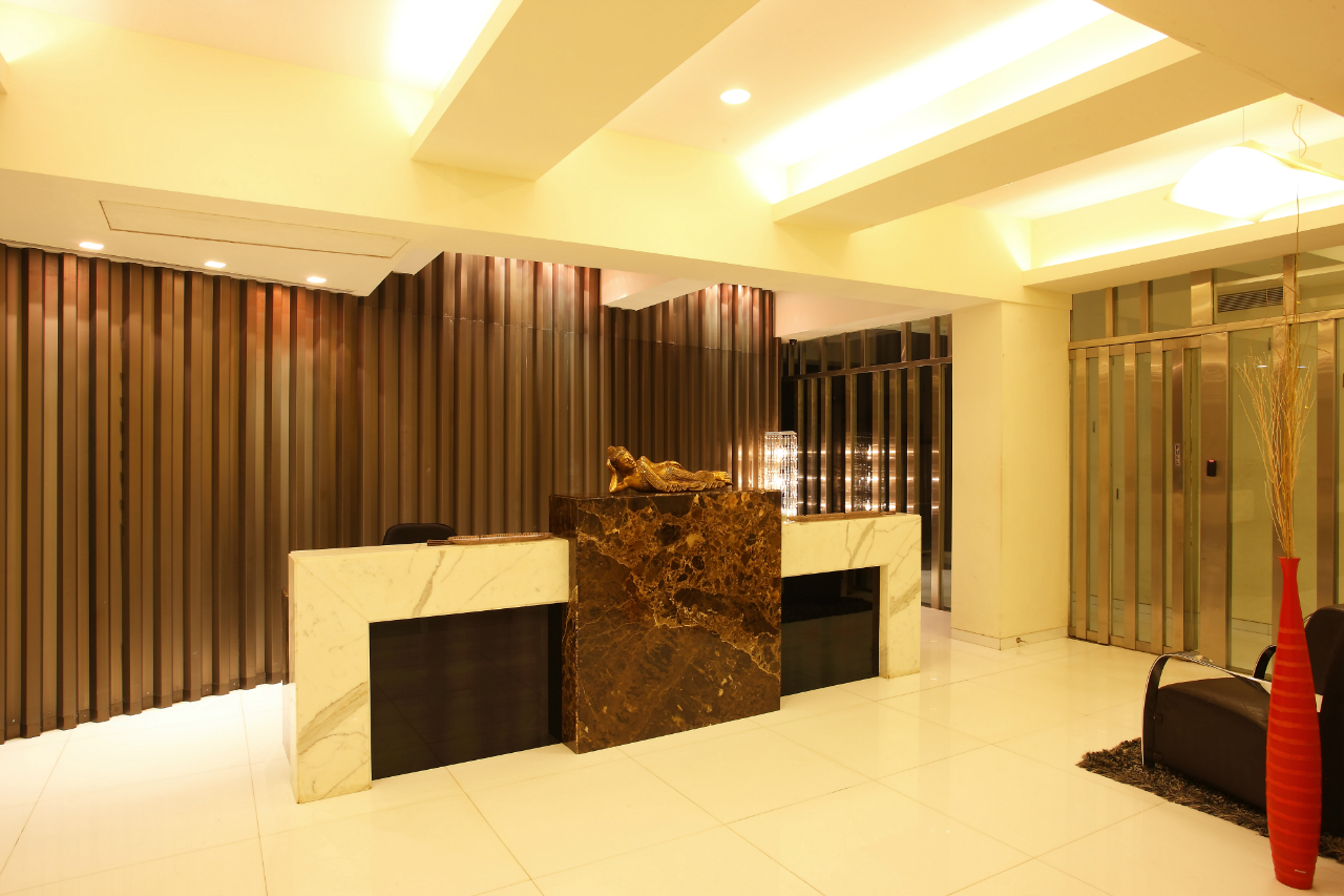
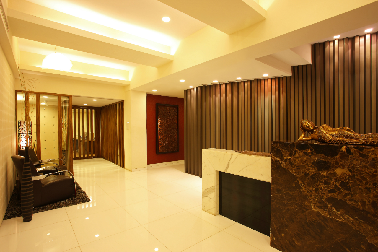
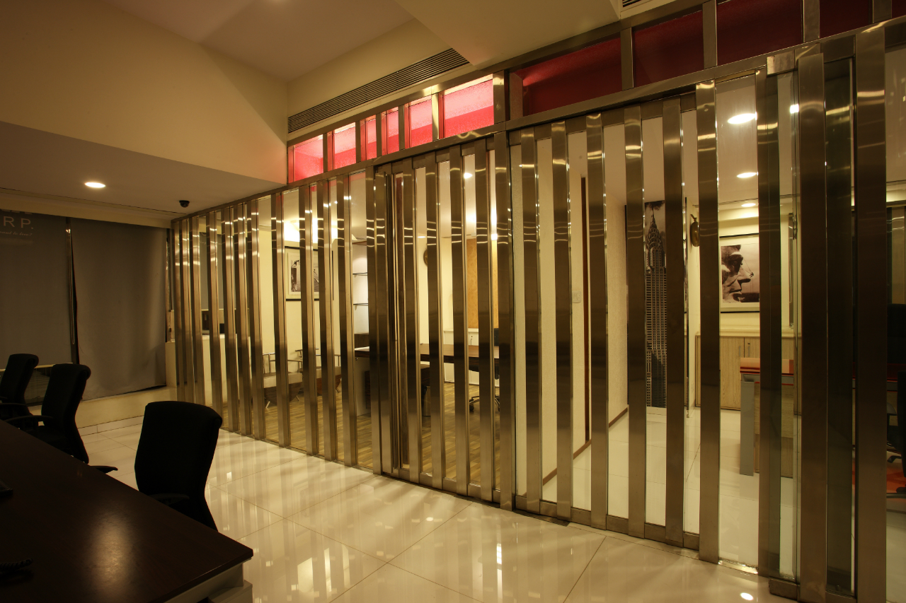
Since we were designing an office for the builder, we thought it was apt to highlight the space with significant play of materials. The cabins had stainless steel mullions with glass. Due to the combination of materials used in the project, you will find the décor flowing seamlessly throughout the office. Italian marble and corrugated sheets along with play of materials make the space stand out.
Give us details of the décor in the executive cabin?
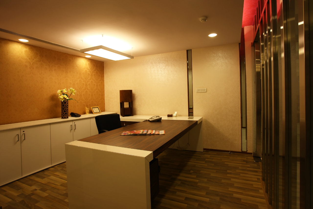
To enhance the executive cabin, convex lenses were embedded to the walls. The importance of using convex lenses is that when the light is switched on, you will notice a soft glow in the cabin which adds visual interest to the space.
Did you face any challenges while executing the project?
Matching the requirements of the client keeping the expansive space (20,000 sq. ft) in mind was one challenge. Since the furniture was sourced from Italy for the project, coordinating with the Italian counterparts, overseeing the details, sizes and designs without physically being present in Italy was another aspect we took care of. Use of contrasting materials like corrugated sheets and convex lenses on the wall elegantly was another challenge. We successfully blended low quality and high quality materials with little hassle and the result was amazing.
How did you accessorize the space giving it an aesthetic appeal?
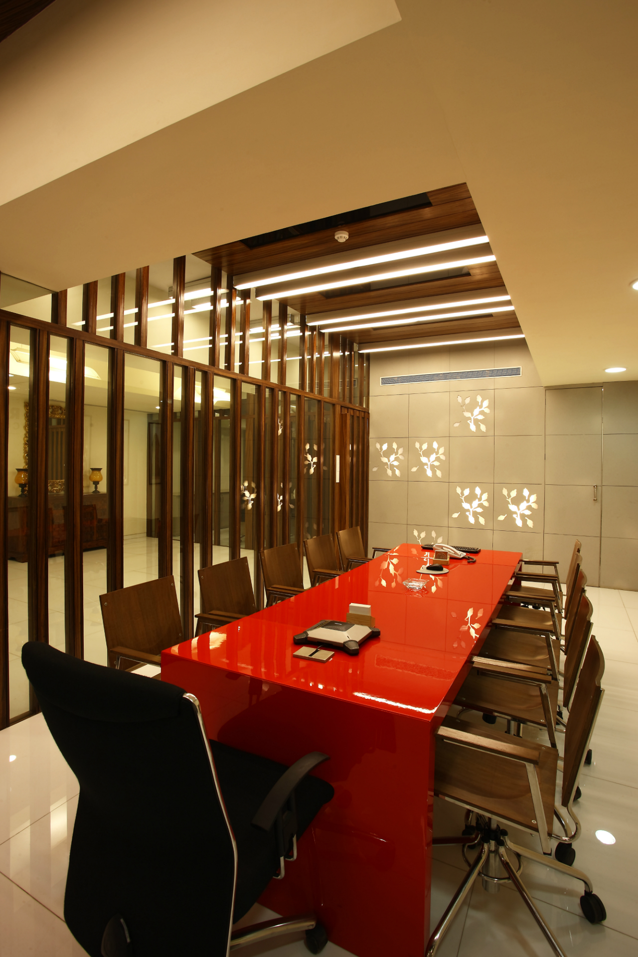
We wanted to give the office space a homely cum work environment and wanted to stay away from giving it a formal mundane look and feel. To achieve the same, we sourced accessories like creative wall clocks, planters from all over the country and used them throughout the space. Wood and steel chairs in one of the executive cabins was also used to personalize the space. Wallpaper used in the cabins and the conference room enhances the visual appeal and luxury quotient of the office. Besides laser cut modules in Bison board (backlit leaf pattern) creates a subtle and relaxing atmosphere, giving a subtle touch to the office space.
How did the client and staff react to the final outcome?
The client was very happy with the end result as it portrayed and matched their expectations. In fact some of the staff members appreciated the design and felt it resembled international design and style.
How did you manage to demarcate the zones without compromising on the design or quality aspect?
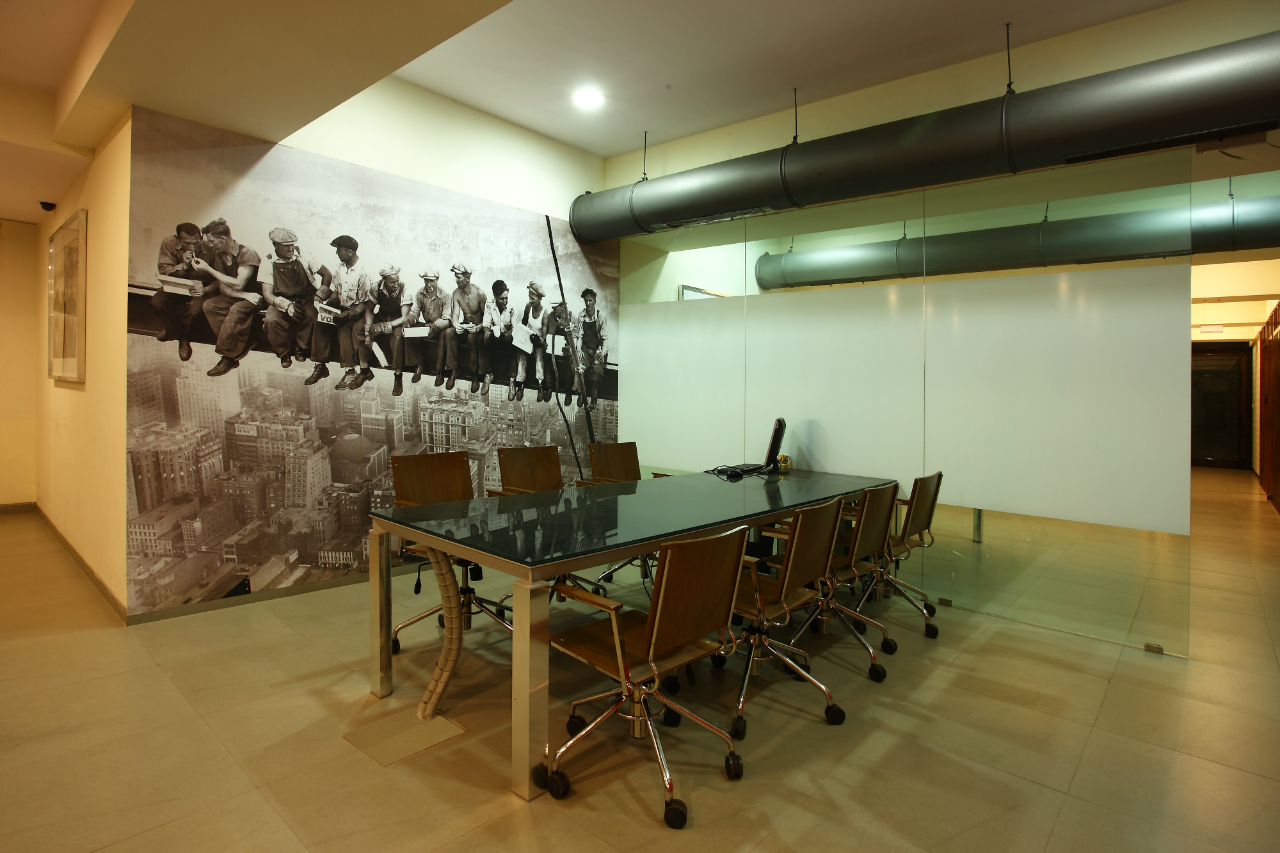
Combining different styles of furniture is a cumbersome task and anything could have gone wrong if not executed appropriately. However we managed to blend these elements seamlessly and get the right outcome as desired that complemented the space flawlessly. To highlight the cabins, we used coloured glass. Partitions had glass in orange colour. For the marketing reception area, we used bamboo chairs. Although the back side of the chair was decked up with bamboo, it had an ergonomic feel and made the user comfortable when seated on it. Similarly the engineering department had a 16 ft by 15 ft tall poster with skyscraper background and workers sitting on the beam and having lunch. This poster blends well with the environment of the engineering department.
